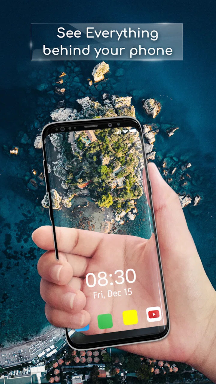
Transparent Wallpaper
- 4.5
- Rating
- 10.00M
- Installs
- Free
- Price

 Analysis by App-foxy
I tried Transparent Wallpaper because I wanted a phone background that felt less like a separate picture pasted behind my icons and more like part of the device itself. The idea is simple: use a transparent wallpaper effect to make the home screen feel more personal without replacing the whole visual style of the phone. In practice, I found that its value depends less on dramatic decoration and more on how carefully you choose an image, place your icons, and think about readability.
This is a free personalization app from Firehawk, available for users whose device runs Android 5.0 or later. It is rated for Everyone, and its current version is 2.2.2. The app has built a large audience, with an average rating of 4.5 from around 357 thousand ratings and more than 10 million installs. That popularity makes sense: Transparent Wallpaper is aimed at a very specific visual change, and it does not ask you to learn a complicated launcher system before seeing the result.
I would recommend it most to someone who wants a distinctive home screen but does not want to replace their launcher, install a full icon pack, or spend an evening tuning dozens of settings. I would be more cautious if you depend on strong visual contrast, use a very busy background, or expect a complete accessibility solution rather than a decorative wallpaper tool.
You May Also Like

 Blood Strike: 2.5 Anniversary
Blood Strike’s Loadouts Turn Every Drop Into a Tactical Gamble
A close look at Blood Strike’s custom loadouts: how fast access to signature weapons reshapes its battle royale rhythm, rewards preparation, and narrows the gap between fights.

 Pandora - Music & Podcasts
Pandora’s Music Is Easy to Start, but Harder to Recover
Pandora’s strength is its low-effort path from a seed to a station. Its weak spot is how much confidence it asks you to place in connection, setup, and quiet recovery.

 8 Ball Pool
 Is Built on Rivalries, Rematches, and Routine
A close look at the rivalries, rematches, shared routines, and unanswered safety questions that turn a quick pool match into a persistent mobile community.

 Samsung Music
’s Quiet Strength Is Playing What You Already Own
Its reach comes less from spectacle than from dependable access to a personal library. That simplicity is both the app’s strongest retention engine and its ceiling.

 AccuWeather: Weather Radar
AccuWeather Review: A Quick, Clear Forecast for Everyday Decisions
For everyday plans, the best forecast is the one you can understand quickly. AccuWeather makes rain timing, radar, and local conditions easy to act on, with a few trade-offs.

 Hill Climb Racing
Why Hill Climb Racing Still Turns Crashes Into One More Run
A tiny car, a bumpy hill and one more upgrade: Hill Climb Racing keeps resurfacing because its simple chaos makes every near-miss feel personal.
More From Our News Desk
View All News


How the transparent look affects readability and navigation
I find readability is the key to whether this visual effect feels like a useful personal touch or an obstacle. In this section, I focus on how background detail can change the ease of spotting familiar icons, then turn to the physical and sensory effort involved in making the screen comfortable.
A quick visual change without rebuilding the phone
The strongest part of Transparent Wallpaper is its narrow focus. Instead of trying to become a full launcher, widget platform, or theme store, it concentrates on the wallpaper layer. That makes the first experiment relatively approachable. You can keep the home-screen arrangement you already understand and change the visual relationship between the background and the rest of the interface.
That matters for navigation. If you already know where your essential apps are, a wallpaper change does not force you to relearn gestures or move folders. I found this more comfortable than switching to a completely new home-screen system, especially when I wanted a visual refresh rather than a new workflow. The app works best as a quiet change behind familiar controls.
There is also a useful distinction between a wallpaper that merely looks attractive in a preview and one that remains usable under real icons. A high-detail image can make labels disappear into the background. A transparent effect can intensify that problem because the image becomes part of the visual field instead of sitting clearly behind a uniform layer. My practical advice is to judge the result with your actual first-page icons, not with an empty preview.
Choosing images for clear labels
For everyday use, I prefer images with calmer areas where app names and symbols normally appear. A photograph with a large face, a bright sky, or a simple architectural shape tends to be easier to live with than a dense collage. If the most important icons sit over strong edges, text and symbols can become tiring to locate, even when the wallpaper initially looks impressive.
This is one of the app's less obvious trade-offs: the more visually transparent and expressive the background feels, the more responsibility falls on the image itself. Transparent Wallpaper cannot make a complicated picture automatically calm. The final result is a combination of the app's effect, the chosen image, the icon design supplied by the phone, and the launcher layout.
I also recommend keeping the first home-screen page restrained. Put the apps you use most often over the least distracting part of the image, and move less important shortcuts to another page or a folder. This is not just an aesthetic trick. It reduces the number of objects competing for attention and makes the screen easier to scan when you are in a hurry.
Useful for people who dislike visual clutter
Although a transparent wallpaper sounds visually bold, it can support a cleaner setup when used with restraint. I found that one carefully chosen image looked better than repeatedly changing themes, icons, and widgets. Someone who becomes distracted by too many decorative elements may prefer a simple photograph with generous empty space.
On the other hand, users who need large, unmistakable visual targets may find the effect less helpful. The app changes the background, but it does not turn small icons into larger controls, simplify the launcher, or guarantee that labels remain prominent. If your priority is fast recognition rather than personal style, a plain high-contrast wallpaper may be the better choice.
Motor and sensory considerations in daily use
Comfort is not only about what the screen looks like; it also depends on how much adjustment feels manageable and whether the visual result remains pleasant over time. I’ll consider those everyday demands here before looking at the settings and surroundings where the effect is more or less practical.
Less setup can mean less physical effort
One benefit of a focused personalization app is that it can avoid the repeated drag-and-drop work associated with rebuilding an entire home screen. I would rather make one considered wallpaper change than rearrange every icon, widget, and folder. For people who experience fatigue, limited dexterity, or discomfort from long touchscreen sessions, that narrower task may be easier to manage.
The important caveat is that the app does not remove all interaction demands. You still need to handle the usual phone controls and make choices about the image and layout. If the setup process requires repeated adjustments on your particular device, the physical advantage becomes smaller. I would prepare the image and decide where the main icons should sit before starting, rather than experimenting randomly for a long time.
A practical workflow is to begin with one image that already has a calm composition. Test it on the main home screen, check the labels, and stop if the result is comfortable. Endless fine-tuning is rarely worth it for a background. This approach is especially useful for anyone who finds repeated tapping, scrolling, or visual comparison tiring.
Contrast is the real sensory question
For users with low vision, light sensitivity, visual processing differences, or general discomfort with busy screens, the app should be judged by the final contrast rather than by its name. A transparent effect may look elegant while making icons harder to distinguish. Dark images can help in one arrangement and hurt in another, particularly when pale icons or white labels sit over them.
I would test the screen in the conditions where it will actually be used: indoors, outdoors, at low brightness, and at night if that is part of your routine. A background that works beside a window may become confusing in a dim room. Similarly, an image that appears soft on one display can feel harsh or overly detailed on another.
People who are sensitive to motion should also remember that the wallpaper itself is only one part of the experience. The phone's own transitions, icon effects, and launcher behavior can still affect comfort. Transparent Wallpaper is not a system-wide sensory control. Its contribution is visual personalization, so expectations should stay within that boundary.
Supporting recognition without relying on memory
I like using the app alongside a consistent icon arrangement. Keep communication, travel, work, and frequently used tools in predictable places rather than changing the layout every time you change the image. The wallpaper can then provide personality without becoming the thing you must interpret before finding an app.
This is particularly helpful for people who navigate by position, color, or familiar visual patterns. A transparent background can either support that habit or disrupt it. If the image places a bright object behind a familiar icon, the icon may no longer stand out in the same way. I would change the image before changing the entire arrangement, because preserving location can be more valuable than chasing a perfect visual composition.
Situational access: where the app works and where it struggles
A wallpaper that looks calm at home may be harder to use in bright outdoor light or while attention is divided, so I judge it by the situations in which someone actually reaches for their phone. This section weighs those contexts and leads into the point where personalization stops helping and another approach makes more sense.
A realistic morning-to-evening example
Imagine checking a phone during a rushed morning. You need to open a calendar, message someone, and check a route while standing near a bright window. A decorative wallpaper is useful only if those icons remain immediately visible. If the background contains sharp lines or bright highlights beneath them, the personalized screen can slow you down. In that situation, a quieter image with open space behind the main shortcuts is the sensible choice.
Later, the same phone may be used in a dark room. A vivid image can feel more intrusive at low brightness, while a very dark image may hide details that were visible earlier. This is why I see Transparent Wallpaper as something to configure for a routine, not as a set-and-forget guarantee for every environment. The best design is the one that remains readable during your ordinary transitions between places.
Outdoor use and changing light
Outdoor visibility exposes weak choices quickly. Reflections, glare, and uneven lighting can flatten the difference between icons and the image beneath them. A background that looks balanced indoors may become visually noisy outside. I suggest testing the screen before committing to a detailed picture, especially if you often use navigation, messaging, or payment apps outdoors.
There is a useful trade-off here. A transparent wallpaper can make a phone feel more personal without adding physical accessories or a bulky theme. But the more the background competes with the interface, the more you may need to pause and look carefully. For a person who regularly uses a phone while walking, commuting, or handling other tasks, that extra visual search is a meaningful disadvantage.
Shared spaces and social situations
Personalization can also affect how quickly another person understands your phone. If a family member, colleague, or support person needs to find an app, a heavily customized background may make the screen less familiar. A restrained image and stable icon placement reduce that friction. This is a small but practical form of inclusive design: the phone should remain understandable to someone who did not choose the wallpaper.
The Everyone age rating makes the app broadly approachable from a content perspective, but that does not mean every visual style will suit every user. A child, older adult, or person with sensory sensitivities may prefer a simple image even though the app allows a more striking look. The inclusive choice is not necessarily the most eye-catching one; it is the one that preserves confidence and recognition.
Remaining barriers and where another option is better
For me, the important boundary is that a background change cannot replace tools designed to improve access across the whole phone. I’ll explain who may be better served by a simpler screen or dedicated accessibility controls, then bring those trade-offs together in my overall recommendation.
It is not a replacement for accessibility settings
The biggest limitation is scope. Transparent Wallpaper is a personalization app, not a dedicated accessibility utility. It should not be treated as a substitute for the phone's text-size controls, display adjustments, screen reader, magnification, color options, or simplified launcher tools. If you need those functions, use the operating system features or an app designed specifically around them.
That distinction also affects expectations about control. A wallpaper tool can influence the visual background, but it cannot guarantee readable labels across every launcher, icon style, display mode, or device setting. If your phone applies its own cropping, scaling, or placement behavior, the image may not look exactly as expected. I would consider the result device-dependent and evaluate it on the actual phone rather than assuming a preview tells the whole story.
In-app purchases and the free starting point
The app is free to download, which makes it easy to try before deciding whether it belongs in your daily setup. In-app purchases range from 99 cents to 99 dollars and 99 cents per item. Because of that wide range, I would pay attention to each purchase screen and avoid assuming that every visual option is included at no cost.
For someone who only wants to test the transparent effect with a personal image, the free entry point may be enough. For someone who expects a large collection of premium customization choices, the possible cost deserves more attention. My advice is simple: first confirm that the basic experience is comfortable and readable, then decide whether any optional purchase solves a real problem rather than merely adding another decoration.
Who should skip it
I would skip Transparent Wallpaper if your main goal is maximum legibility with no visual experimentation. A plain background, a high-contrast system theme, or a launcher built around large controls will probably serve you better. I would also look elsewhere if you want coordinated icons, widgets, gesture changes, or a complete home-screen redesign. This app's focused approach is a strength only when that focus matches what you need.
It may also be a poor fit if you change phones frequently and want a highly repeatable setup. Wallpaper behavior can vary with screen proportions and launcher arrangements, so recreating the same composition may take some adjustment. Users who enjoy tuning their screen will not mind that, but people who want a predictable, maintenance-free appearance may prefer a simpler solution.
My inclusive verdict after using it
My verdict comes down to whether the transparent look adds personality without making routine tasks harder. I’ll balance that appeal against the practical limits discussed above and offer a simple way to decide whether it fits your own phone habits.
A thoughtful visual layer, with limits worth respecting
Transparent Wallpaper succeeds when I treat it as a controlled background experiment rather than a complete phone makeover. It lets me personalize a familiar home screen while keeping the rest of my navigation intact. Firehawk has built an app with a clear purpose, and the strong user response—an average of 4.5 and more than 10 million installs—shows that this focused idea appeals to many people.
Its accessibility story is mixed in a realistic way. The simple concept and limited scope can reduce setup work, preserve familiar icon locations, and support users who want a calmer personal arrangement. At the same time, transparency can reduce contrast, increase visual competition, and make quick recognition harder. Those effects depend heavily on the chosen image, the phone's display, the launcher, and the user's own visual needs.
My best recommendation is to design for the least comfortable situation, not the prettiest screenshot. Choose an image with quiet space behind important icons, test it at different brightness levels, and keep the layout stable. If labels remain easy to read and the screen feels calm in your normal environments, the app can add personality without getting in the way.
The right test is not whether the wallpaper looks impressive for a minute, but whether you can find your essential apps without extra effort. For users who pass that test, the free app is an enjoyable way to make a familiar phone feel more individual. For users who need guaranteed contrast, larger targets, or deeper accessibility controls, a simpler wallpaper or an accessibility-focused launcher is the more responsible choice.
FAQs for Transparent Wallpaper
01What is Transparent Wallpaper and how does it work?
Transparent Wallpaper is a personalization app designed to give your Android or iOS device a see-through style background. Depending on the version and device, it may use the camera to display a live view behind icons and widgets, or create an illusion of transparency with specially designed wallpapers. After selecting an effect, users can usually preview it, apply it to the home screen, and sometimes configure the lock screen separately.
02Does Transparent Wallpaper use the camera, and is it safe for privacy?
Some transparent wallpaper features require camera access because the app displays a live camera preview as part of the effect. This means the application may need permission to use the camera while the wallpaper is active. Before installing, review the permissions requested and the developer’s privacy policy. If you are uncomfortable with continuous camera access, choose a static transparency-style wallpaper or deny unnecessary permissions.
03Will Transparent Wallpaper drain my battery or affect phone performance?
Battery usage depends on how the app creates the transparent effect. A static image normally has little impact, while a live camera wallpaper can consume noticeably more power because the camera and display remain active. On older or less powerful phones, users may also experience reduced performance, warmth, or slower battery charging. Lowering brightness and selecting a static option can help.
04Is Transparent Wallpaper compatible with every Android and iOS device?
Compatibility is not identical across all phones and tablets. Android devices generally provide more flexibility for live wallpapers, although support can vary by manufacturer, launcher, Android version, and screen settings. iOS has stricter wallpaper and background limitations, so some features may be presented as animated or static wallpapers rather than a continuously active transparent view. Check the store listing before downloading.
05Is Transparent Wallpaper free, and are there advertisements or in-app purchases?
The app may be available as a free download, but free versions commonly include advertisements, premium wallpaper collections, customization tools, or optional purchases. Some features can also require a subscription or a one-time upgrade. Review the pricing details shown in Google Play or the App Store before confirming a purchase, and check whether the selected wallpaper remains available after uninstalling or changing devices.
Pros
- Creates a clean
- see-through look using your camera feed.
- Simple setup with minimal controls to learn.
- Can make static wallpapers feel more dynamic.
- Offers a distinctive style for home and lock screens.
- Useful for checking surroundings while using your phone.
Cons
- May increase battery usage because the camera stays active.
- Privacy-conscious users may dislike continuous camera access.
- The background can look distracting behind app icons.
- Results depend heavily on lighting and camera quality.
- May not work smoothly on older or less powerful devices.

Transparent Wallpaper
Gallery